Level Design
Level Design Devlog
Now that basic player movement is working the next step was to make some different levels! In Colour Party, the concept is that there will be short rounds where you have to get to a certain colour. Therefore it is important I have a decent amount of different levels to keep the game interesting.
Considering that the only important thing about the levels is that they have colours, I could simply make them in an image editor. I also decided I would make it just 10x10 pixel art with each pixel being about the size of the player.
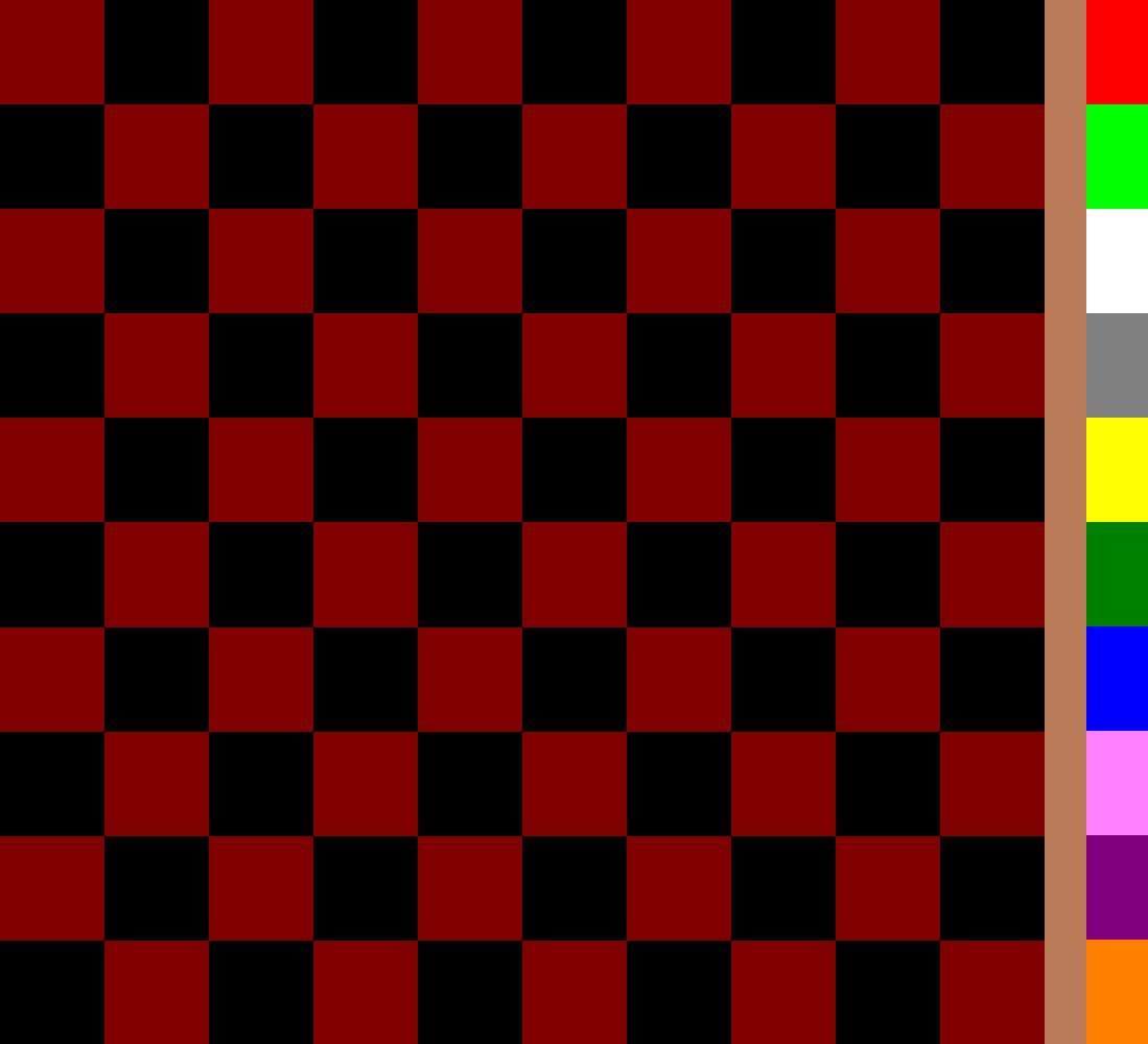
I modified the first level that I made to have bolder colours and used those 10 colours in the rest of the levels (although not all of them have all of the colours).
These are the colours I used and their RGB values (I made this consistent with all the levels):
Red 255 0 0
Lime 0 255 0
White 255 255 255
Gray 128 128 128
Yellow 255 255 0
Green 0 128 0
Blue 0 0 255
Purple 128 0 128
Pink 255 128 255
Orange 255 128 0
I'm not particularly experienced with pixel art editing so I just used Microsoft Paint as it was easy enough. I simply made a template image which I then used pick and fill to make 15 more levels.

The template.png that I used for making the levels with all the colours used and an empty 10x10 grid.

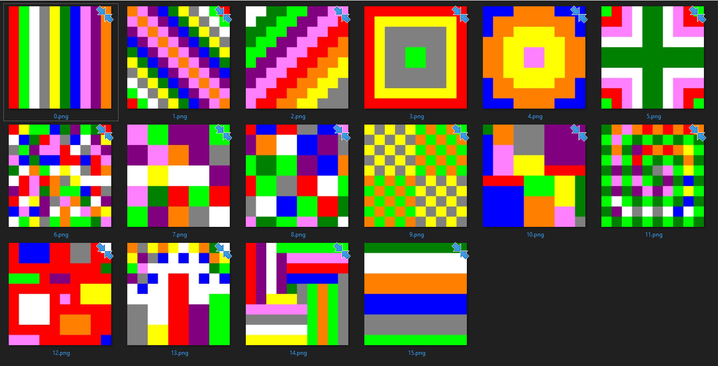
The 16 levels I created.
Now that I had some more levels, I wanted to make it easy to view them in the game. So I made a script for testing purposes that just changes the level to a random one once you press the R key. This script works by creating a new sprite from a random texture in a given texture2d array and setting the map game object's sprite to that.
This was not all useless as I will end up using the same method to change the level automatically when the game is finished - after every round a new random level will be chosen.

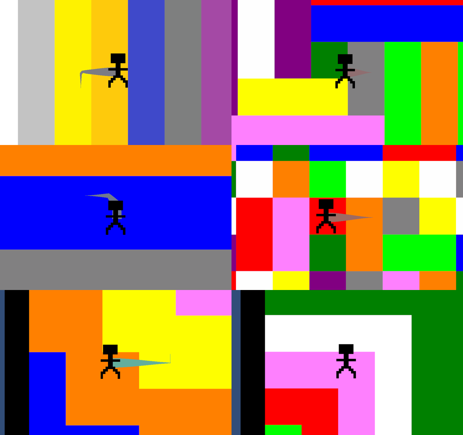
Testing the new levels!
I am happy with how the levels look in game and I am glad I didn't make the art more detailed: a different approach could have been to make the art more complicated and not simply pixel art - for example having the diagonal stripes, spirals, and circles actually diagonal or curved rather than lots of squares.
I can definitely see making new levels or modifying the current ones later on happening, the more the better really and I will be able to find out how they go once the gameplay advances.
The feedback I recieved from the levels is summarised here:
- one comment was that the symmetrical levels wouldn't be explored as there is no point leaving one corner. In my opinion given that the game is meant to be fast paced and you won't be on a level for very long, it is good to have some easier / symmetrical levels as well as the more complicated ones. Out of the 16 levels, half of them are completely asymmetrical, and only 3 such that all corners are identical.
- there weren't too many comments about the levels apart from that they are "very colourful"!
- someone suggested that when a level is randomly chosen the player is also randomly positioned. Although this is just a testing demo it might be an interesting idea to have that, although once the rest of the game is implemented, I think given there are a decent amount of levels it might not add much to the game.
Files
Colour Party
More posts
- Game Testing part 2? Final DevlogMay 28, 2023
- Documentation + User GuideMay 26, 2023
- Game TestingMay 21, 2023
- Presentation and GraphicsMay 14, 2023
- Puzzle ImplementationMay 07, 2023
- Player MovementApr 23, 2023
- Game ConceptApr 14, 2023
Comments
Log in with itch.io to leave a comment.
Nice colors!